
by Abdullah Faraz
March 7, 2025
Color is one of the most powerful tools in design. It can evoke emotions, influence decisions, and even shape perceptions about a brand or message. When it comes to flyer design, choosing the right colors can mean the difference between grabbing attention or being overlooked. Understanding the psychology of color will help you create compelling flyers that drive action and leave a lasting impression.
Why Color Matters in Design
Research shows that people make a subconscious judgment about a product within 90 seconds, and up to 90% of that assessment is based on color alone. This means that the colors you choose for your flyer can significantly impact its effectiveness.
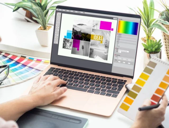
Whether you want to create excitement, build trust, or convey urgency, leveraging the right color palette is essential. A great way to experiment with different color combinations is by using free printable design templates with Adobe Express, which allow you to customize your flyer without needing professional design skills.
Understanding Color Psychology in Marketing
Each color triggers different emotions and associations. Here’s how some of the most commonly used colors can influence flyer design:
Red: Energy & Urgency
Red is bold and attention-grabbing. It stimulates excitement and urgency, making it a great choice for flyers advertising sales, special promotions, or clearance events.
Best Uses:
- Call-to-action buttons (e.g., “Buy Now,” “Limited Offer”)
- Clearance and discount flyers
- Food-related promotions (stimulates appetite)
Blue: Trust & Dependability
Blue is associated with trust, professionalism, and calmness. It’s often used by corporate brands and financial institutions to create a sense of security and reliability.
Best Uses:
- Corporate event flyers
- Healthcare and wellness promotions
- Technology-related advertisements
Yellow: Optimism & Happiness
Yellow conveys cheerfulness and warmth. It’s an excellent choice for flyers promoting fun events, children’s activities, or summer-themed promotions.
Best Uses:
- Event and festival flyers
- Children’s products or services
- Hospitality and travel advertisements
Green: Growth & Sustainability
Green symbolizes nature, health, and renewal. It’s commonly used for eco-friendly initiatives, wellness brands, and organic products.
Best Uses:
- Health and wellness flyers
- Sustainability and eco-friendly promotions
- Financial services (symbolizing prosperity)
Black: Elegance & Luxury
Black represents sophistication and exclusivity. It’s often used in high-end branding and minimalist design.
Best Uses:
- Luxury product launches
- Fashion and jewelry promotions
- Exclusive VIP event flyers
Expanding on Color Combinations and Their Effects
Using a single color is not enough; you need to consider how colors interact. Here are some popular color combinations and their psychological effects:
Complementary Colors
These are colors opposite each other on the color wheel, such as blue and orange or red and green. They create a vibrant, high-contrast effect that grabs attention.
Example: A red and green color scheme is often used in holiday flyers to evoke a festive mood.
Analogous Colors
These colors sit next to each other on the color wheel, such as blue, teal, and green. They create a harmonious look and are ideal for conveying calmness and trust.
Example: A wellness center flyer might use shades of green and blue to create a soothing effect.
Monochromatic Colors
This scheme uses different shades of the same color to create a cohesive and professional look.
Example: A corporate business flyer may use various shades of blue to maintain consistency while adding depth.
How to Use Color to Highlight Key Elements

Your flyer should guide the reader’s eyes to the most important information. Here’s how to use color to emphasize key sections:
- Headlines: Use a bold, contrasting color to make the title pop.
- Call-to-Action (CTA): Make buttons or text stand out with a color that contrasts with the background.
- Important Details: If you have an event date, discount percentage, or limited-time offer, use bright colors like red or yellow to grab attention.
Mistakes to Avoid When Choosing Colors
- Using Too Many Colors – Stick to a simple palette of 2-3 colors to keep your design visually appealing.
- Ignoring Accessibility – Ensure your flyer is readable for people with color blindness by using high contrast and clear fonts.
- Over-Saturating Your Design – Bright colors are great, but using too many can overwhelm your audience.
- Neglecting Brand Identity – Your colors should align with your brand’s personality and message.
The Role of Cultural Color Associations
Different cultures perceive colors differently, so it’s crucial to consider your target audience when designing a flyer:
- White: In Western cultures, it symbolizes purity and simplicity, while in some Eastern cultures, it represents mourning.
- Red: It signifies passion and excitement in the U.S., but in China, it represents good luck and prosperity.
- Green: Commonly associated with nature and health in many cultures, but in some, it can symbolize envy or wealth.
Leveraging Color Trends in Modern Design
Staying up to date with current color trends can help your flyers remain fresh and appealing. Some modern trends include:
- Minimalist Color Schemes: Many brands are opting for softer, muted tones instead of bright, overpowering colors.
- Gradient Effects: Smooth transitions between colors add a dynamic and modern touch.
- Neon and Bold Colors: Used in tech and entertainment industries to create a futuristic and energetic feel.
Practical Tools for Choosing the Right Colors
If you’re unsure which colors work best together, there are several tools available:
- Adobe Color Wheel – Helps create harmonious color schemes.
- Canva Color Palette Generator – Automatically generates palettes from images.
- Coolors – A fast and easy way to generate color combinations.
Conclusion
Color is more than just an aesthetic choice—it’s a strategic tool that influences how people perceive and respond to your flyer. By understanding the psychology behind color and applying it effectively, you can create flyers that not only capture attention but also encourage action.
Experiment with different color combinations and refine your flyer design to ensure it resonates with your audience. The right colors will not only make your flyer visually appealing but also enhance its overall impact. Start designing today and make every color choice count!